01 . Claims management softweare
The project aimed to address several key issues affecting user experience, efficiency, and overall functionality of the software. By systematically tackling problems in various aspects of the software — Claims Table View, Claims Profile View, Work Items/Tasks/Actions, Communications, Automation, Navigation, and the Dashboard view — I aimed to create a more intuitive, efficient, and user-friendly platform.
Problems Identified
The present interface is antiquated, featuring a dated design with suboptimal user experience and user interface elements.
Communications:
Poor organization and categorization in the communications section.
Automation:
Repetitive tasks due to lack of automation.
Navigation:
Poor organization and categorization in the communications section.
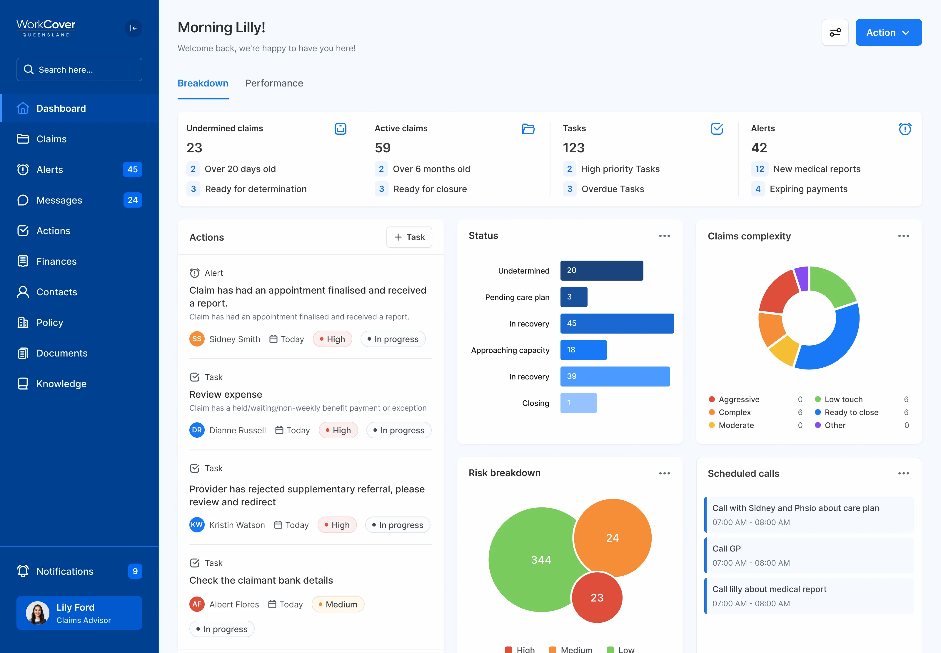
Dashboard:
Non-optimized dashboard view impacting workflow efficiency.
Claims Table View:
Lacked insightful data, and had limited sorting and filtering capabilities.
Claims Profile View:
Missing relevant medical information, navigation issues, and disjointed user experience.
Work Items/Tasks/Actions:
Confusing and overwhelming work items, lack of customization and clarity in task management.