Designing for a mobile-first compliance app required balancing simplicity, speed, and clarity in high-pressure environments like hospitals and clinics. My key considerations included:
Mobile-Friendly Navigation
I introduced a bottom navigation bar with clear, consistent icons for Home, Tasks, Documents, and Menu. At the centre, a large “+” action button opened options for lodging data (feedback, incidents, improvements, repair requests). This made the most common actions instantly accessible with a single tap.
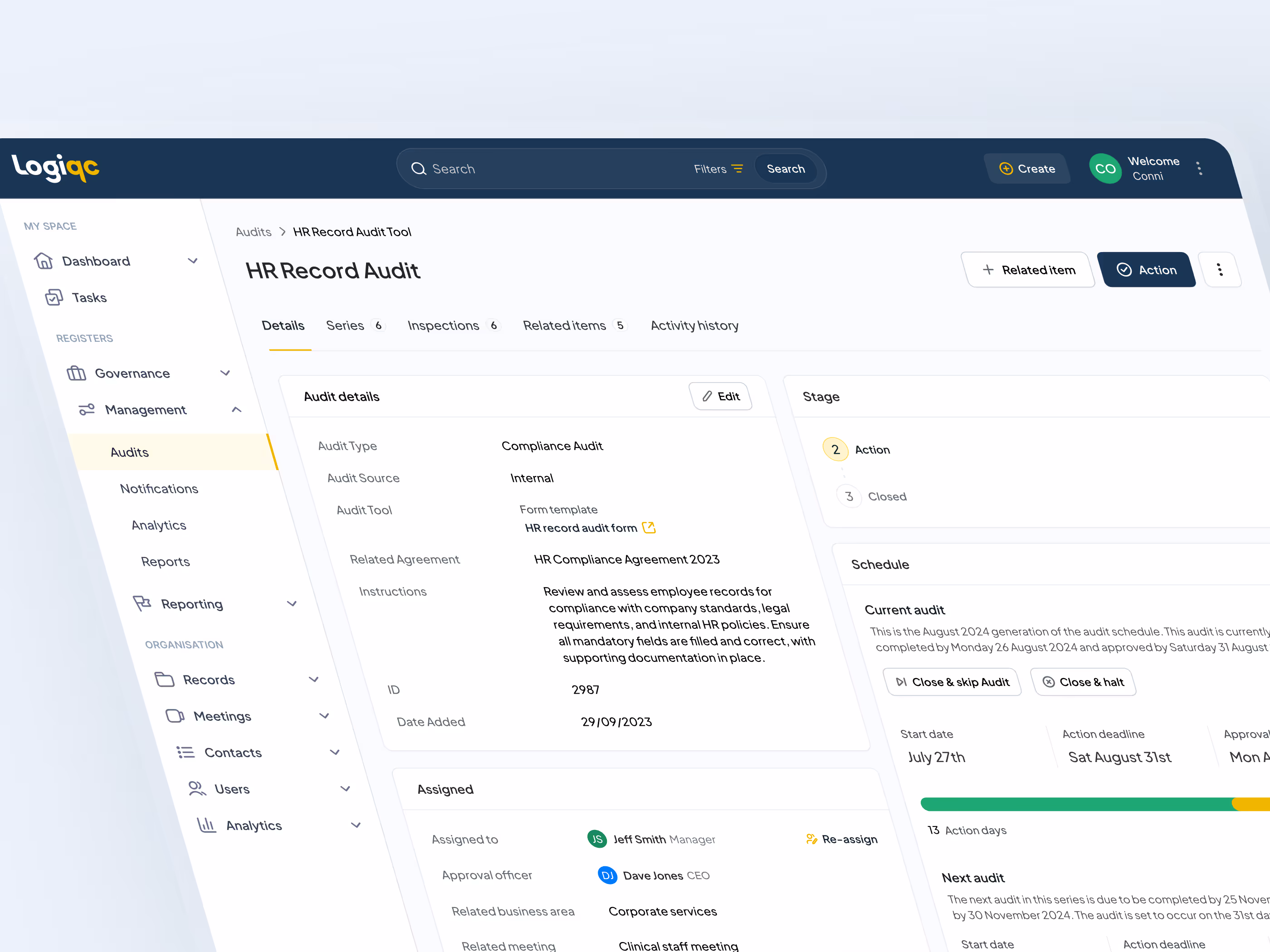
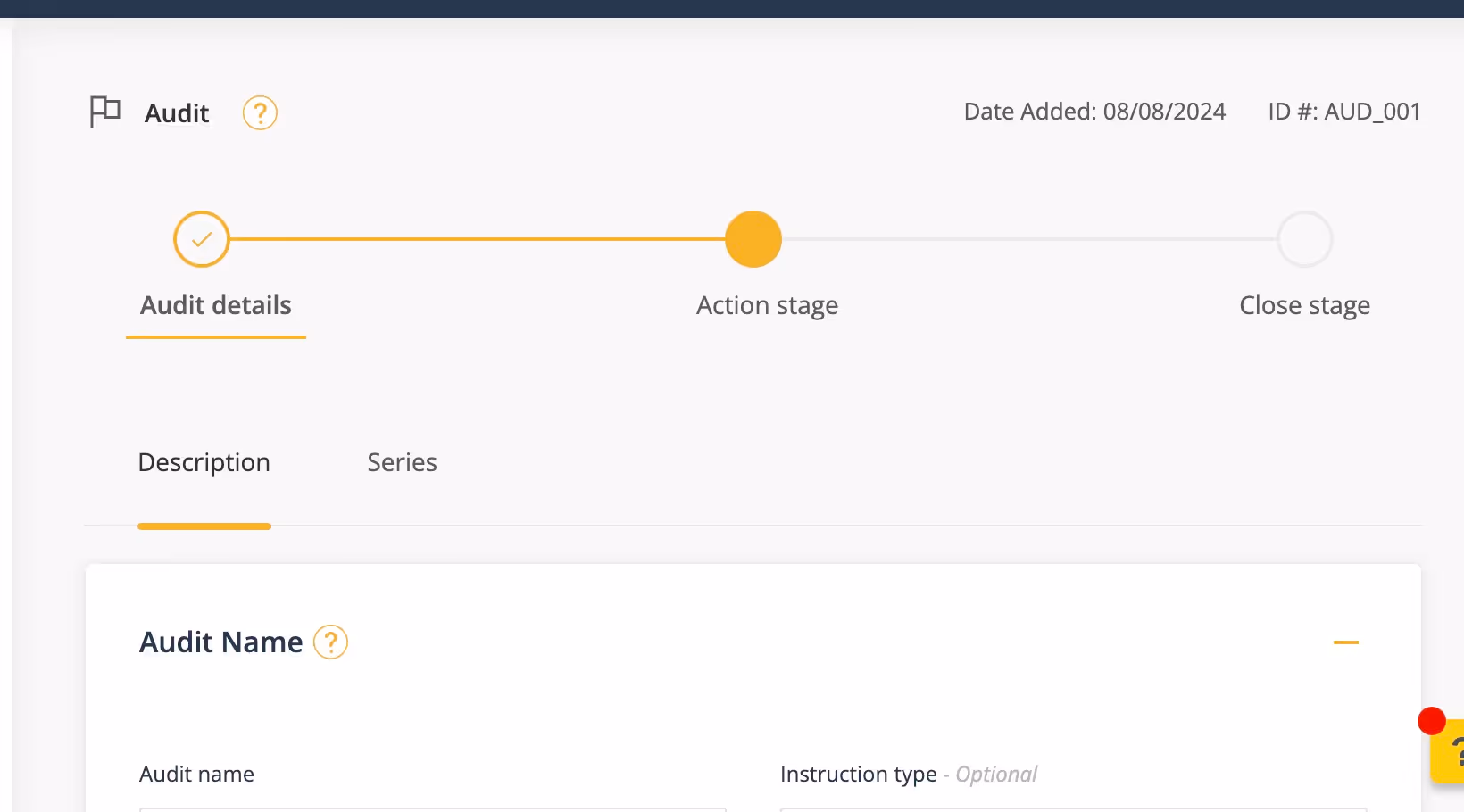
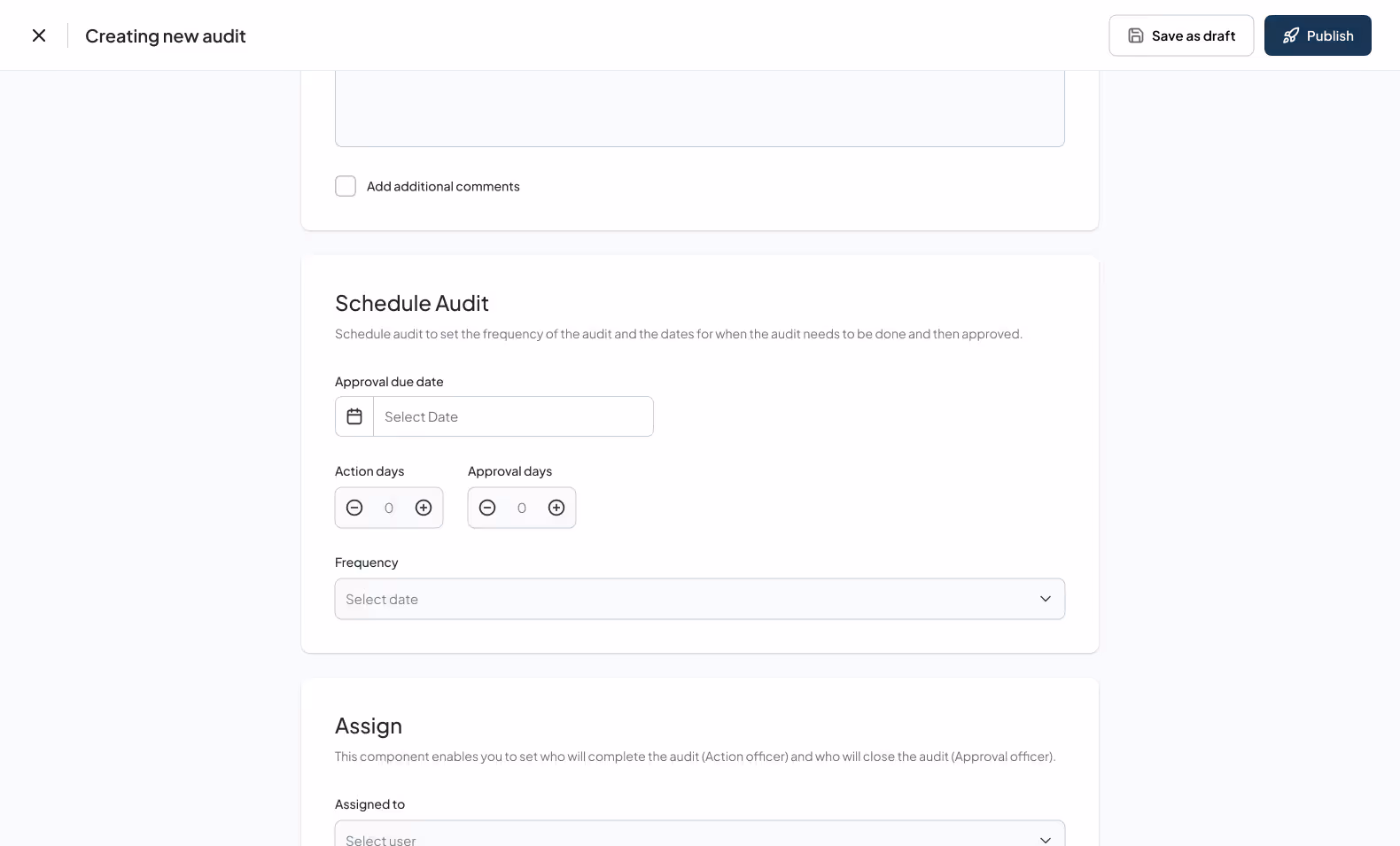
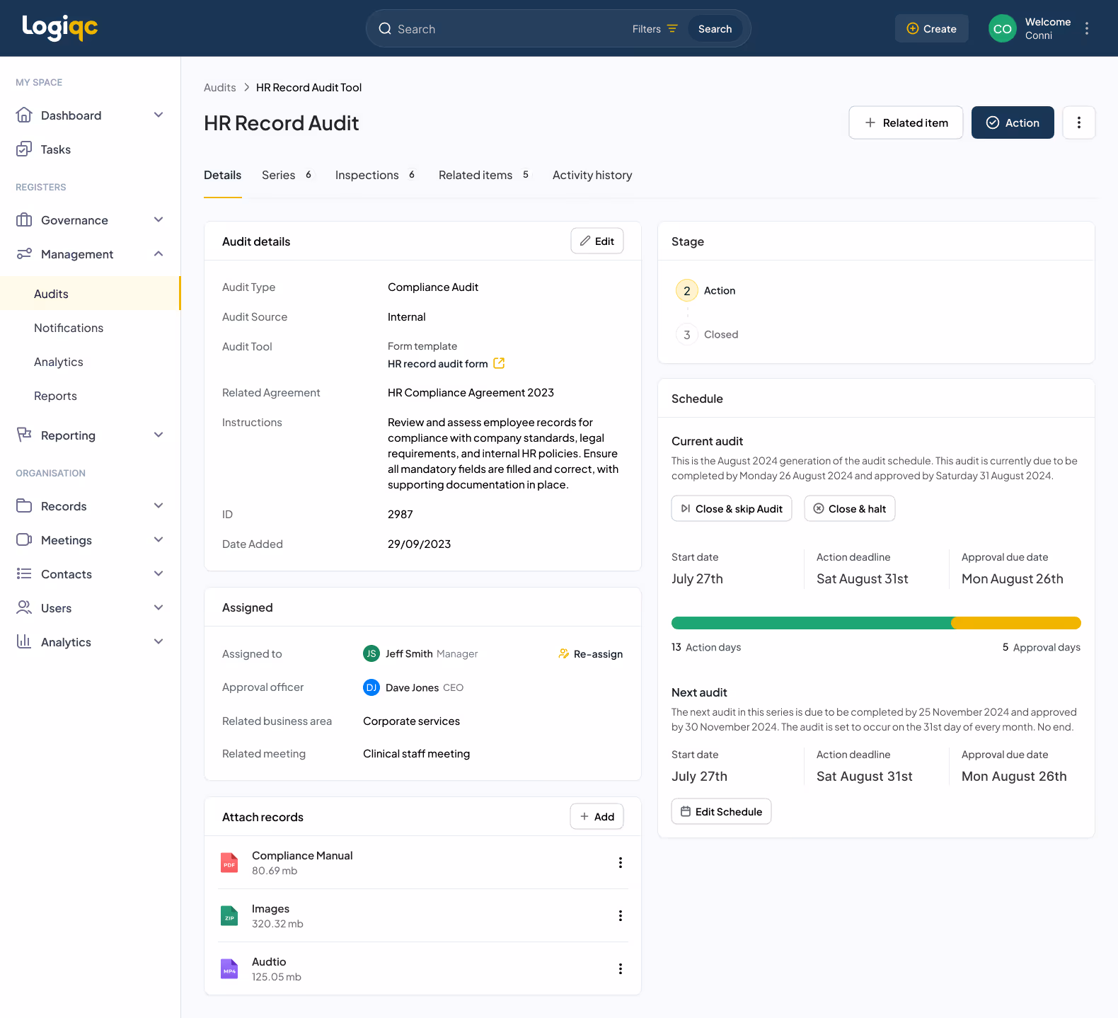
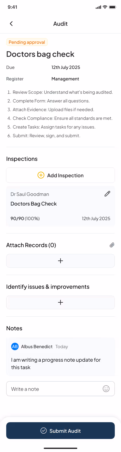
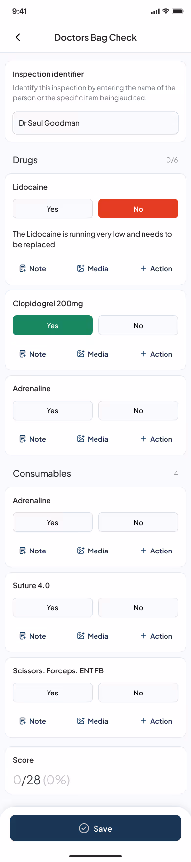
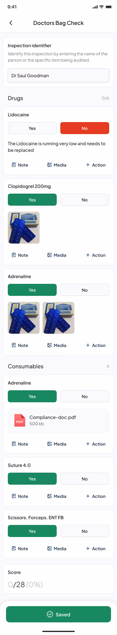
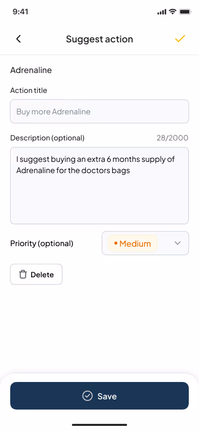
Audit Forms Optimised for Mobile
Audit workflows, such as doctor’s bag checks, were redesigned with clear fields and touch-friendly inputs so staff could complete them quickly on a phone without frustration.
Document Access
The document view was structured for quick search and navigation, allowing users to easily find and open critical resources like checklists while in the field.
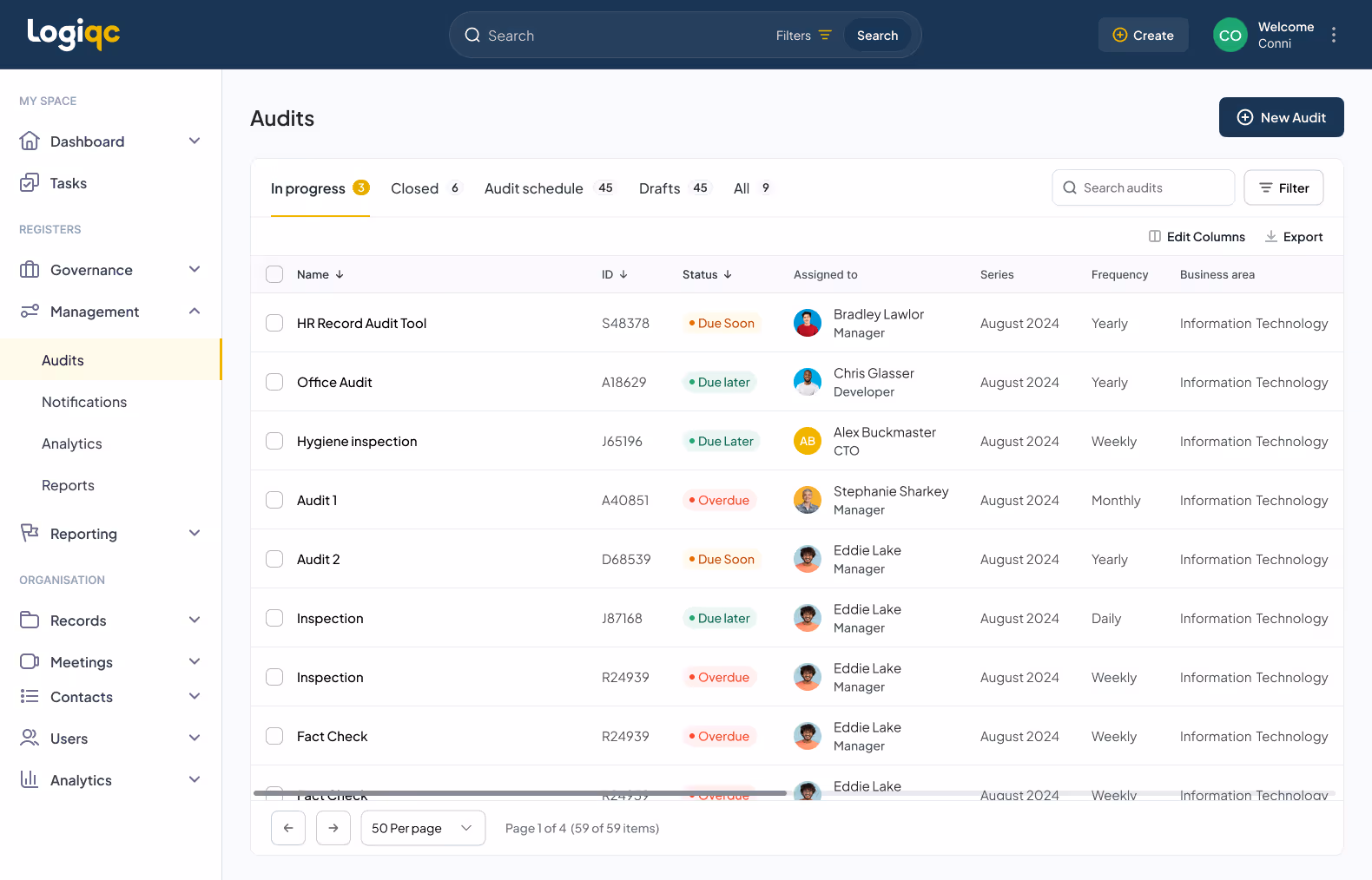
Task Management
The task view initially focused on audits, showing staff which audits were overdue or pending. This section was designed to scale, with flexibility to accommodate future task types as the platform grows.
These design choices created an experience that felt intuitive and efficient for busy frontline workers, while also ensuring the app could evolve with future needs.


